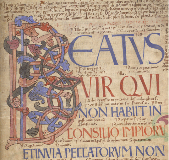
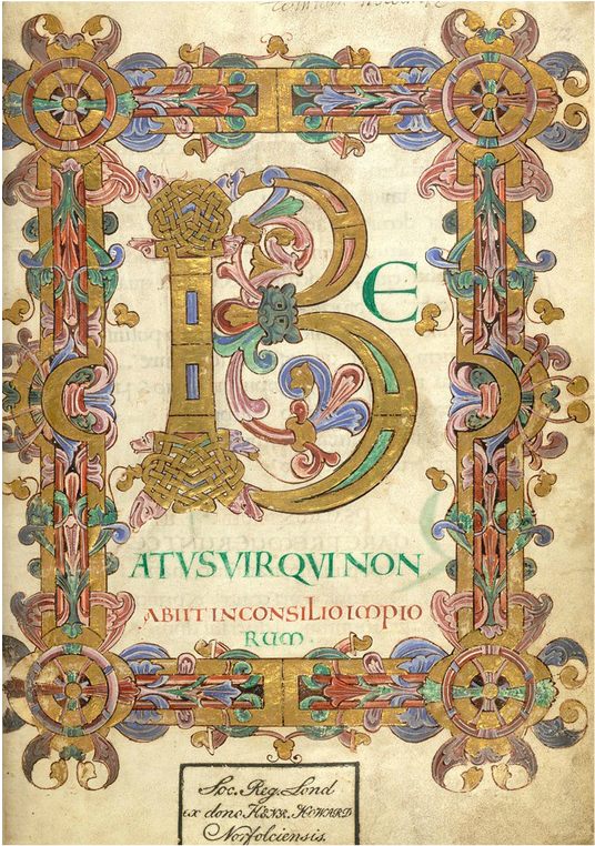
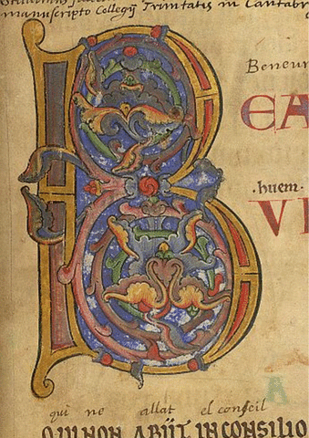
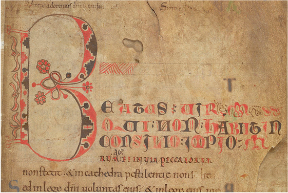
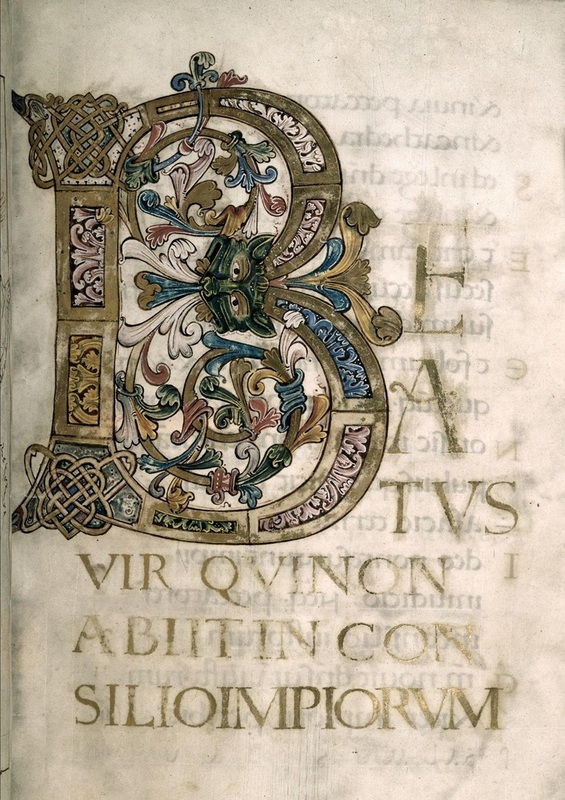
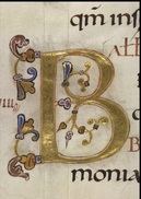
 Something light and frothy this weekend, and restorative. You can’t blame me. I’ve had a week full of biblical exegesis and hermeneutics. Now everyone needs to come down from that! My answer? Beautiful Bs. I’ve always been one for pictures and imagery – a visual learner, you see – and over the years, as a medievalist, I’ve developed a bit of a thing for illuminated initials. There’s just something about them, especially Anglo-Saxon ones. I think it’s all that intricate interlacing; it reminds me of my own doodling when I’m on the phone (long, long calls from Aunty so-and-so). Now, just to be precise, here: 'illuminated initial' (or 'decorated initial') is a broad term, distinct from 'historiated initial' which, as the descriptor suggests, is an initial with a visual story within it. Perhaps you noticed the David and Goliath one I showed the other week. I should probably say, too, that ‘illuminated’ strictly speaking describes the deployment of gold in manuscript decoration. But I’m not that fastidious in my designations, so today we’ll go with: initials that have been ornamented in some way with colour. As for my penchant for Bs, well, no doubt someone could offer me a Freudian interpretation (please don’t), but really it’s probably quite straightforward. You see, I’ve seen more illuminated Bs than anything else. And that’s because B is invariably for Beatus. Blessed. Now everyone wants a bit of that, don’t they? Below are some of my favourites, all from the British Library. Enjoy! Please note: All images in this post are Public Domain and identified by the British library as free of any known copyright restrictions. Just click onto the image to be taken to the British Library website. Beatus vir - Happy man! Note the biting beast head at the centre of the upright. These fellas get in everywhere. If you look carefully, you'll also spot two other biting beasties: a small, orange-red serpentine biter (centre) and a bigger, paler one at the top of the upright. Is it a bird? You decide. The Anglo-Saxons were not known for their realism! The foliate interlacing (now there's a technical term if ever there was one) is classic Anglo-Saxon (well the Irish did it too). The leaves by the way are acanthus – very typical. Aha! A big B! This is a full-paged, full-bordered beauty. It appears at the beginning of the Psalms in the Arundel Psalter (known also as the Eadui Psalter), so it needs to be big and bold. And just look at those amazing zoomorphic (love that word), interlaced terminals on the upright of the B. Astonishing! I think they are dogs' heads, by the way – I know the one bottom left looks like a duck-billed platypus; but, come on, this is eleventh-century England! Oh, and this beautiful B really is illuminated: GOLD! This one isn't Anglo-Saxon, but around a century after, from the second half of the twelfth century. There is no real interlacing here – and no biting beasties – but I love the soft blue wash of the background. And there is gold! Again, it forms the start of the Psalms. This is a cheeky little one, isn't it? No real fuss. Something rather youthful about it. Interestingly, though it appears in an Anglo-Saxon manuscript of the eleventh century (it may have been owned by Bishop Leofric, died 1072), the decorated B wasn't put in place until the twelfth century. Talk about procrastination! And it looks like all that zoomorphic interlacing was beyond this artist. But I love it, all the same. Had to put this one in – if only for that marvellous beastie! Look at its wonderful, sprouting flames of acanthus, and its coordinating head sprouts, like feathers. These fellas are sometimes referred to as ‘masks’. You can see why. I could imagine someone in the 1920s wearing it to a racy masked ball. Sorry, getting a bit carried away. Actually, less anachronistically, the face resembles Anglo-Saxon Hell mouths. (Perhaps Hell mouths should be for another Saturday afternoon post – what do you think?) I have to mention the exquisite, interlaced, gold knot-work on the upright, and those fabulous scrolls of acanthus that form the round bits of the B. What gorgeousness! And to finish as I started ... B is for Beati inmaculati ... immaculate, indeed! This is from the same manuscript as the one above. It’s smaller than the others we’ve looked at: about 6 cm (American readers, that’s just over 2 inches). It’s exquisiteness on vellum!
Well, if you've enjoyed my bit of visual light relief, let me know. I can always do something similar another time. Ah well ... back to the exegesis!
0 Comments
Leave a Reply. |
Details
|
